6 Colors That Can Make Your Print Product STAND OUT

Choose Colors Carefully
While it's hard to say why colors make people feel a certain way, researchers have found that up to 90% of fast judgments made about products can be based on color alone. Color can also play a role in your branding. In fact, when it comes to picking the "right" color, some research has found that predicting your customer’s reaction to the color in relation to the product is far more important than the individual color itself. If you're appealing to a group of people who want to feel rugged and strong, your product or print material that's covered in glitter and pink may not go over as well. Let your business and your demographic help you choose appropriate colors to represent your company.

Psychology of Color
Here is a guide that can help you choose the best colors for your custom print project.Red
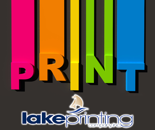
Red invokes excitement, as well as youthfulness and boldness. The color is attractive and looks good in a variety of shades and on many projects. It conveys liveliness, potential power, passion, and enthusiasm. Red can also stimulate an appetite, which makes it a great color if you're in the food industry, and it's also a popular color with females.
Orange

Friendly, cheerful and confident are just a few of the feelings that orange brings about. It combines the energy of red and the happiness of yellow. Orange has a very high visibility and is a great option for catching someone's eye. It can also be a good choice when promoting food products and toys.
Yellow
This bright, friendly color can invite optimism, clarity and warmth. It's an attention-grabbing color, and it blends well with dark backgrounds - making it a great color to feature in your print materials. On the flip side, yellow can be used to create feelings of caution, and studies show many people find this color unlikeable.Green
When you want to convey peace, growth and health you can use green to help get the point across. It also suggests stability and endurance, as well as safety when advertising medical products. Green is also a great color to show that you are a "green" company - like us! We include green hues throughout our print and web materials to convey that we are a green printing company in the United States.
Blue
Trust, dependability, and strength are just a few traits that blue can relay to your customers. It can also convey a sense of control and authority, which explains why you may find it in the logos of financial institutions, and well-known global brands.
Purple
Purple represents your company with sophistication and is a color that invokes beauty and luxury. It is generally linked with classy and/or pricey products, so you may target the high-paying or upscale market when you use this color.Best Printing Company at the Lake of the Ozarks
The colors you use can help with the audience you're aiming for. Let our team help you target the right customers with your print and promotional materials. From large to small print orders we can help you achieve just what you need with your business cards, pamphlets, books, ads and more! Check out our website today to learn about the different services we offer and how we help protect the earth with our green printing.


Comments
Post a Comment